OK, here’s another post to file under “curmudgeonly old person rant”. Now I’m 40 I’m entitled to be a grumpy old woman.
It looks like I’ll need to update the theme for my blog since it seems to be creating errors willy-nilly. I’ve been cruising the various theme sites trying to find a replacement and one of the more important aspects of any new theme in 2013 is that it’s responsive – that is, it needs to look the same whether you view it on a PC screen, a smartphone, a tablet or one of those inter-dimensional space devices they use on Star Trek.
Since 2011, smartphones have outsold PCs and the trend has continued for the last two years. This article says the laptop ecosystem is dying because “when people use a laptop, they expect everything to be free, and when they use a smartphone they expect to pay.”
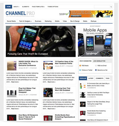
The change to smartphones and portable devices is now making itself felt in the way designers are making web pages, especially WordPress themes. To give an example: here’s the Channel Pro theme released in May 2012.
Advertisement

Support independent, ethically made, award-winning porn. Bright Desire features all of my erotic films and writing. A membership to Bright Desire gets you access to every movie I've ever made and lets me keep making female friendly porn!
Click here to find out more.
-------------------------------------------------------
There’s a lot going on there: pics, columns, multiple headlines and excerpts to choose from. It’s a busy page but I feel like it’s interesting. I want to explore it. It gives me a chance to browse quickly and spot something that might be relevant to me.
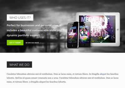
Now everything seems to have been simplified down. I’m seeing huge amounts of white space, enormous photos at the top of pages, giant font sizes and – often – only one or two pieces of information on the main page. And single columns. Everywhere, the wide single columns. Like this Grind theme:
And the Gawker sites like Jezebel have recently gone all HUGE too *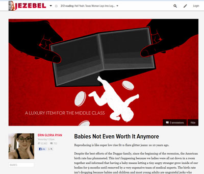
Smartphones are all about scrolling up and down. And that’s what I’m seeing the web become – two dimensional, enormous and really fucking awful to look at.
These pages feel wrong to me. They feel like they’re breaking some unwritten design rule that I’ve internalized from way back. It’s like they’re the bastard love child of slow-loading Flash sites and large-type Mills and Boon novels. The designs give me the nagging suspicion that the site is all style and no substance.
It’s a bias on my part, pure and simple. I remember the days of blink tags and html pages where the the Times New Roman text went right across the screen. And so we got hip and groovy with tables and made everything look nicer. It meant we could have columns and, praise be, columns were great. Because we could put lots of ads and extra information in there and turn our pages into much more complicated and interesting things. So I’m a bit set in my ways. I like to see webpages with a lot of stuff on them. And also, I work on PCs most of my time so I want to see stuff optimized for that. I’m kind of tired of moving my chair back from my monitor because the font on the page is so massive I feel like I’ve developed a sudden case of macropsia.
But now I’m in the minority. And I have to stop being so curmudgeonly and get hip again, or be left behind. Still, it’s making me tetchy.
PS. When I do see columns, they’re all over the fucking place. I want my columns to line up NICELY on the horizontal plane please. Not like you see in Exhibit A: Pinterest:
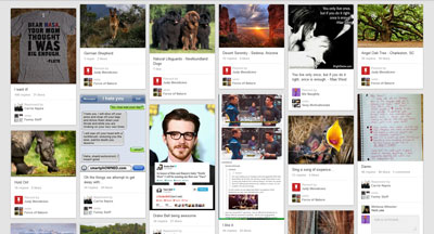
Messy. Hard to read. Nervous-tic-inducing.
Maybe I just have a very mild, design-related form of OCD. Maybe I should have been a typesetter or subeditor instead of an ageing, self-taught webmistress and pornographer.
Please tell me I’m not alone in dreading the arrival of the smartphone-optimized web.
*OK, so that Jezebel page does have a small column for the author info but I think you get what I mean.
PSS. Speaking of Pinterest, I joined it and made a board called Sexy Motivationals. Yes, it bugs me that the page isn’t neat.
Agree, but “it needs to look the same whether you view it on a PC screen, a smartphone, a tablet, etc.” isn’t really what responsive design is. It’s about using certain features of CSS3 to allow the design to *change* according to the size and shape of the screen, to optimise the content and layout. Whereas sites used to be designed for desktop screens, and mobile devices had to either make do or perhaps use a very basic — and separate — mobile version, responsive sites are supposed to look good and work well on all devices, but by looking different on those devices, not the same. If it seems that sites are being optimised these days for mobile screens, at the expense of desktop screens, that’s bad design, not responsive design.